|
|
 |
Fan Art - 09/08/01 |
 |
Mantra
"There are painters who transform the sun into a yellow spot, but there are others who with the help of their art and their intelligence, transform a yellow spot into the sun."
- Pablo Picasso
|
 |
New Fan Art - 09/08/01
|
 |
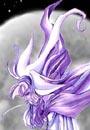 |
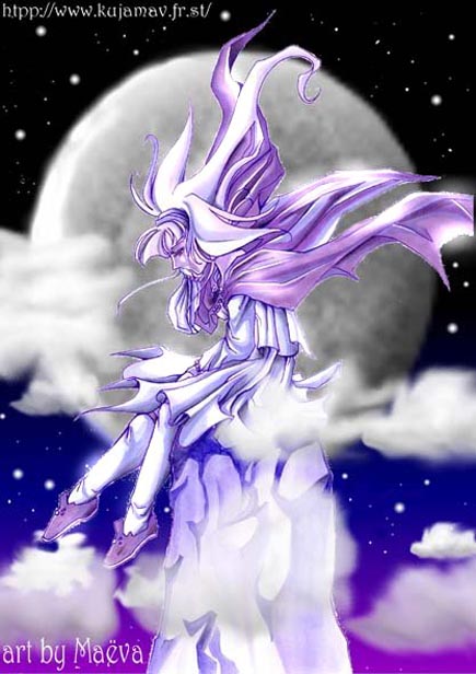
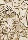
"Sierra on the Night"
Artwork by Maëva
Sierra of Suikoden 2
Comments: another Sierra! (yes yes I will change next time^^; I will send you a pic about Xenogears if I can^^;;;;;). well Sierra was colored with my markers and the background with paint shop pro 6! I don't know how to think about this art.... and violet color again (I think I have a problem with this color^^; poor me^^; )
|
 |
"Night Light"
Artwork by Laura
Sydney of Vagrant Story
Comments: This is supposed to be Sydney during the ending of the game right before you-know-what happens...I think I did a pretty spiffy job with the lighting considering it was the first time I've ever attempted lighting like that. Enjoy.
|
 |
"Forgotten"
Artwork by Laura
Carlin Ramsus of Xenogears
Comments: A long long time ago (back in April of this year I believe) I did a picture of Ramsus....Now this picture was ok at the time - but looking back at it yesterday I decided to work on it a little more. The problem with it was that it didn't really look much like Ramsus and the expression on the guy's face wasn't very conducive to the mood I wanted to convey. I think it is better now, though certainly not perfect. It does look more like Ramsus. In case your wondering the place he is standing at is supposed to be a dump (or something of that nature) on Solaris.
|
 |
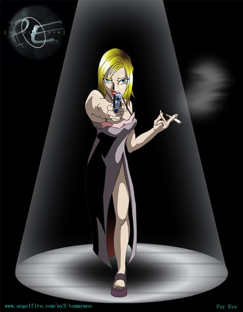
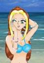
Aya of Parasite Eve
Comments: I met the coolest girl at college named Eve. She promised me she'd play the game if I'd make her a poster of it. This is the internet-friendly-sized version of that poster. I think blending airbrushed hair with a cel-style body gives a cool effect. Also I think Aya needed a cigarette. Definitely a cigarette.
|
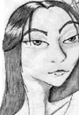 |
"Former Sorceress"
Artwork by Serafina
Edea Kramer of Final Fantasy VIII
Comments: I made this with just pencil while on vacation in Cape Cod.... I always found Edea to be such a paradoxical character; Matron one day, then, boom, she's trying to kill you. who knows? not much else to say, other than i'm somewhat proud of it and i know i probably won't like it in about a week, so hey. i hope it's good enough for RPGamer! ^_^;;;
|
 |
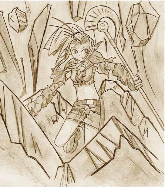
Masquirin of Shining Force 3
Comments: Sega will pay for not bringing scenarios 2 and 3 to the US. Anyway, this really came out of nowhere when I was supposed to be minding some kids at work. It reminds me a bit of the cover art to Shining the Holy Ark. Either way, the quality isn't that high due to the fact that I never use anything but pencils and computer paper. Oh well. Enjoy...
|
 |
"Karen Bromide"
Artwork by Katie
Karen of Harvest Moon: Back to Nature
Comments: I'm a huge fan of Karen. A while ago I drew bromides of all the bachelorettes from HM:BtN, and I really liked this one I did of Karen. I colored it with prisma colors a while ago, then recently touched it up in Adobe Photoshop. This is my third submission to RPGamer fanart, although none of my stuff has ever been posted before. Hopefully,
that'll change this time. ^_^
|
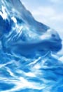 |
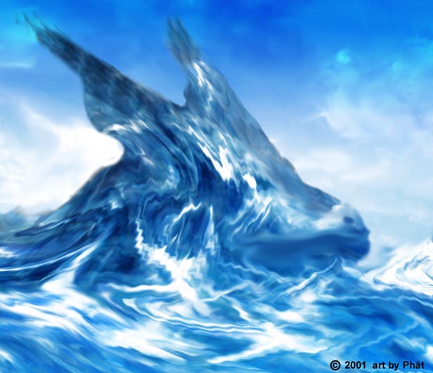
"Water Camouflage"
Artwork by Phát
Leviathan from the Final Fantasy Series
Comments: This is an artwork I made about a month ago. It was sketched in pencil and colored in PS 5.0. Its Leviathan from the Final Fantasy series. I tried to make Leviathan blend with the water as much as possible. It took a while to finish. The result was not as good as I wanted it to be but I'm satisfied.
|
 |
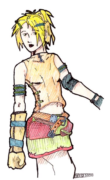
Rikku from Final Fantasy X
Comments: Well, this is my first real fanart submitted, but I've got more
time now so I may send some more later. I know that this pose of Rikku is practically a copy of the cg image of her, but I only did it to practice her clothing and body type. Then it turned out pretty well, so I decided to color it, something I don't do much. I trashed the goggles cause I
didn't really like them. Well, if you have any comments/suggestions, you can email me anytime.
|
Feedback
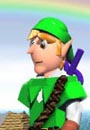
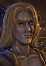
"3D Link"
Artwork by Great Heap
Link from Legend of Zelda: Ocarina of Time
Comments: I've made a lot of this before using Bryce and Photoshop, but this is my first attempt at a person. This is also my first submission to RPGamer. Most everything was made in Bryce, while the final touches were done in Photoshop.
Director Comments: First of all, this is a really great rendering. I know firsthand how difficult object modelling can be in Bryce, and you've done a fantastic job.
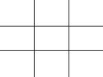
There is something that I think you could do to make this much more effective. See how Link is dead center in the image? He basically cuts the frame in half. As well, the horizon line, while not dead center, is very close to the midpoint. This kind of layout divides the frame into quadrants, and while not "incorrect" by any means, is usually not the best way to allocate your space.
I'm glad you put the rainbow arc in, as that definitely helps to break up the space and keep your eye moving, but consider different camera angles in this scene. Photographers often speak of the "rule of thirds", which basically just refers to the division of the frame into 9 segments, like the image to the right
If you use those dividing lines as guides to the placement of your objects and images, you will find that your composition becomes a lot more interesting. In this case, perhaps the horizon line could be lowered to the bottom horizontal line, and maybe Link himself could be off-center a bit, possibly walking towards the camera. In 3D space, you can achieve angles and camera views very quickly and easily, even ones that would be impossible with a physical camera. The rule of thirds is just one method of dividing space, but it is a good one, and fundamental in understanding others. Experiment with different composition layouts, and see which ones you like best.
|
Shards
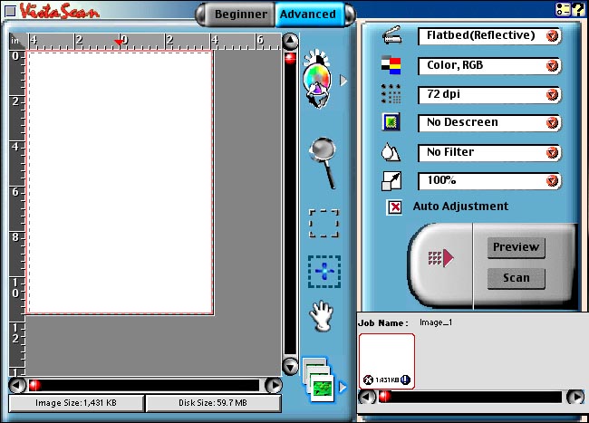
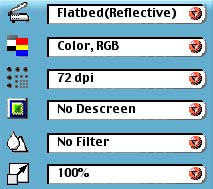 The first menu should almost always be set to Reflective. This is the setting for any solid surface, like paper or canvas. Other options here include Transmissive, which is what you use to scan transparent things (like overhead transparencies) and Negative, a special setting to scan photographic negatives. The first menu should almost always be set to Reflective. This is the setting for any solid surface, like paper or canvas. Other options here include Transmissive, which is what you use to scan transparent things (like overhead transparencies) and Negative, a special setting to scan photographic negatives.
The second menu is your color selection. You should keep this on RGB color all the time if you have Photoshop. Other settings include Web Color, which only allows for the 216 web-universal colors, and a black & white setting. Now, you can use these settings if they pertain to what you are scanning, but I highly recommend that you scan everything as RGB color, and then alter it later in Photoshop. I have found that scans of black & white photos come out much more vividly if scanned in RGB color and then converted to true black & white in Photoshop.
The third menu is dpi (dots per inch), and this is the biggest choice you have to make when scanning. The higher this number, the longer it will take to scan. If you intend to only show this image on the web, you only need to do 72 dpi, as that's the highest that can be displayed on computer monitors (unless you have one of those really pretty flatscreens). If you want to print this image, then you need to do at least 200, sometimes higher, depending on what kind of printer you will be using. It is very important to know beforehand what kind of output device your image will be going to. If you don't have any idea, then scan it at somewhere around 400 or so, just to be safe.
As well, there is another use for this menu. If you have a small image that you want to make larger, and then show on the web, scan it in at a higher resolution. Say you have a drawing that is only 3 inches by 4 inches, and you want to double that. Scan it in around 150 dpi, and then you will be able to later convert it to 6 by 8 at 72 dpi, effectively trading size for resolution, without any quality loss.
The fourth menu is the descreen menu. Ignore this for fanart concerns and leave it off. This is only used for special settings when scanning newspaper articles or high-resolution art magazines.
The fifth menu is the filters menu. If you have Photoshop, you may refer to this as the "Useless Crap" menu. It will contain filters like blur and sharpen, which can also be found in Photoshop. However, since this is free scanning software and not expensive graphics software, these filters will turn out a lot uglier than the Photoshop ones. Never use them. If you do not have a graphics program with these filters, and you wish to apply them, you can give them a try, but be advised that scanning software pretty universally sucks at filters.
Finally, the last menu is the resize menu. It's another one I recommend you never use. This will make your image larger or smaller, but it will do a vastly inferior job to what most graphics programs are capable of. Use it only as a last resort.
|
This column was not filmed before a live studio audience.
|