THE CRAVE GAMING CHANNEL
V'lanna
 

Fan Art - 10/07/01


News & Updates


contest

The Okage Wickedness Contest is underway!
Click here for full contest details.


In Other News:
Make a little birdhouse in your soul.


In This Edition

    New Art: 10 works
  Feedback/Shards: Shade Levels
 

Fanart Information

  Submission Guidelines
Fanart FAQ
 

Mail the Fanart Director

  Fanart Submissions:
  fanart@rpgamer.com
Email:
  merripen@rpgamer.com
 

Archives

  Recent Columns:
  something wicked...
  Duality
  Dropped Frames

Fanart Archive:
 1999  -   2000  -   2001

Artist Listings


The Fine Line


"At the touch of love, everyone becomes a poet."

          - Plato


Greetings. Welcome to the little place I call Fanart.

The Okage Wickedness Contest continues this week. I've answered a few emails regarding it, and I will repeat those here for the benefit of everyone who might be wondering. Yes, you may include multiple antagonistic characters if you have a good reason to do so. Yes, they can be from various games (let's not go nuts though - it should feature someone, not be RPG Villain Convention 2001). Yes, you may include the protagonist of the game, but ONLY if it somehow is necessary to strengthen the piece, and ONLY if they are clearly not the focus of the work. Be careful with this, though - this is a contest for the bad guys. If there are any protagonist characters in your work at all, I expect them to be dead and dying in the background or cowering off in a corner. Seriously, your work may be counted out if any protagonist is too dominantly featured. And lastly, no, Vincent is not a valid evil character. Neither is Alucard or any of those other darkly-heroic types. We're talking the bad guys. Antagonists only. Protagonists need not apply.

What all that boils down to is this: you have some leeway to do your own thing, but your best bet is to pick a single villain and draw him/her as wickedly as you can.

We've got a very nice column for you tonight, filled with some a great selection of fanart. As well, I've provided a small commentary on shading levels this week. It's merged between the Shards and Feedback sections of the column this week, as I think it's a very important lesson. And incidentally, this column will most likely be updated Tuesday-ish rather than Friday-ish from now on. In case anyone pays attention to that sort of thing.


New Fan Art


thumbnail - click to view
"Rinoa"
Artwork by Wren
Rinoa of Final Fantasy VIII

Comments: I think the reason I like Rinoa so much is because my husband says she's just like me...I admit I tend to agree with him. Ink & colored pencil with PhotoShop touch-up.


thumbnail - click to view
"FFVIII Parody"
Artwork by Ryuuzaki
Sephiroth and ??? from Final Fantasy VII

Comments: To understand the parody, you'll have to have seen this picture officially released by Squaresoft. Sephy doesn't look right...he looked a lot better in the sketch. Something about my crappy coloring or inking technique screwed him up. @_@ Dohhh~~~ Well, what can ye do? Maybe he'll look better next time...


thumbnail - click to view
"Luna-sama"
Artwork by Cyllya
Luna and Artemis from Tales of Phantasia

Comments: With the possible exception of Origin, Luna is probably the summon spirit with the best characterization. Quiet, peaceful, and brave. ^_^ Artemis (who is just a horrid-looking chibi in this pic) really cares about her.


thumbnail - click to view
"Girl Cloud"
Artwork by Felix Leong
Cloud Strife of Final Fantasy VII

Comments: It's been about 2 years since my last submission, just being lazy I guess. :) Remember the scene where Cloud has to crossdress as a girl to enter Don Corneo's Mansion? Well, this is an imaginary art of mine (with the best outfit), just meant to be funny (no offense, though :) ). Although originally sketched by pencil, I ended up using the Bezier tool in GIMP to draw the outlines because the scanned image looks dirty :). The results met up with my expectations, but it seems that Cloud is floating in mid-air... ^_^||. (I need more practice, I guess...)


thumbnail - click to view
"Shining Force 1.1"
Artwork by David Lee
Max, Mae, Lowe, and Zylo from Shining Force

Comments: I wanted to do a series of Shining Force fanart because they're great games, but since September I'm working 4 daily jobs so so far this is the only completed piece. Some details were rushed (the Star Wars sword, background & magic effect) but the characters turned out ok.


thumbnail - click to view
"Vincent and Red"
Artwork by Moro Turkey
Vincent and Red XIII from Final Fantasy VII

Comments: I'm not sure why I decided to pair up Vincent and Red XIII but it seemed appropriate somehow^_^ This was done with acrylics and pen and ink.


thumbnail - click to view
"Into the Clouds"
Artwork by Kristin Bergh
Bart and Margie from Xenogears

Comments: After about a year of being totally disgusted with Babel Tower, I've finally started playing Xenogears again. Of course, it would have been better if I had actually been able to *start* from Babel Tower again, but nooo... my file had to be erased by a person that will remain nameless. Anyway, Bart and Margie are my fave pairing in the game. I know some people think their pairing is kinda weird, but I like it! The Perfect Works art book has a picture of their wedding, so there. ^_~ Please send feedback to kristin@kristinsstudio.com!


thumbnail - click to view
"Aerith + Cloud"
Artwork by Natalie Brown
Aerith Gainsborough and Cloud Strife from Final Fantasy VII

Comments: I actually stumbled across a picture on the web with the same composition as this, but with Tifa instead of Aerith. The picture really appealed to me, so I tried my hand at a similar composition. I don't know who originally thought of this composition, but whoever you are, I really liked your pic!


thumbnail - click to view
"Rosa Advances Through the Darkness"
Artwork by LadyChristelle
Rosa of Final Fantasy IV

Comments: This piece has been 10 years in the making! I've wanted to do it for that long! I didn't really want to make Rosa cutesy-- I figured there are enough of those fanarts. Instead I pictured her with something she is not usually pictured with: a staff. I mean, sure she used a bow too, but sometimes I would stick her with a staff. I tried to integrate the typical white-mage sleeves in there too. Hope you enjoy!


Feedback/Shards

thumbnail - click to view
"The Sorceress Rinoa"
Artwork by Lann
Rinoa Heartilly of Final Fantasy VIII

Comments: This is a depiction of Rinoa as the Sorceress, with translucent wings and standing in front of the field of flowers beside Edea's home.

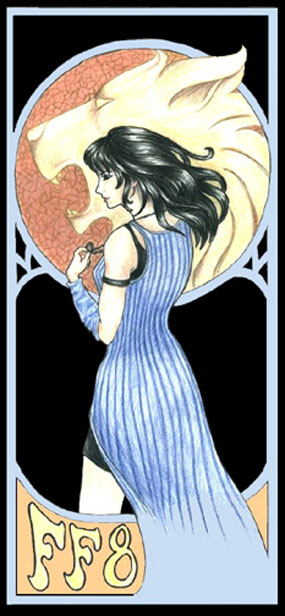
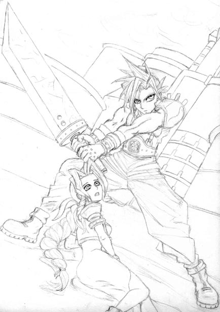
Director Comments: Rinoa certainly seems to have become a popular character around here lately. You've done some very nice work with this drawing, and I have a couple suggestions about shading.
When you pencil-shade something, you have to take the brightness levels into account. Generally, you want to have at least one area of extreme white and one area of extreme black. (Mind you, this is not a rule. Art has no rules, and as soon as it picks one up, someone is quick to break it. It's just a general suggestion to work off.) Now, this image has both of those, but the midtones are, overall, very light. This causes the black tones to stand out. (If the overall image had been very dark, the whites would have stood out more.)
Here's good technique to see how much something stands out and becomes a focal point - either squint or unfocus your eyes, or even use photoshop to blur your image. You will see that the black shapes at the top of Rinoa's outfit and around her upper legs stand out quite a bit. This basically brings them out as the most noticeable part of the drawing. This can be effective, but these parts may not have been what you wanted to emphasize.
Typically, the face is a good target for the higher contrast stuff. To make Rinoa really stand out powerfully, I suggest darkening her hair a bit and lightening the other black parts, to the point that her hair is the darkest part of the image. This will create a high-contrast area framing her face. Moreso, you could leave the background mountains and terrain as it is, very light and low-contrast, and then go in and add more contrast to the rest of her body. You can do this by giving her a thicker outline, or darkening the shadow areas, like under her flapping trenchcoat-ish thing. Remember that the objects with higher contrast will stand out against everything else, and that the extreme blacks and whites will become focal points, so they should be placed strategically. Basically, all this stuff will make Rinoa feel closer to the viewer, with the background falling away, and giving a sense of depth. You've done a good job with the drawing; I suggest going in and making some changes with this info in mind, and see what you think of the new result.


Well, that's all for now. Keep the great art and the Okage Contest submissions coming this next week. As well, I just want to say how much I enjoy my position here at RPGamer Fanart. I like to think that I'm able to provide you with at least a little information that allows you to improve your work. If you ever take anything from the Feedback or Shards portions of these columns and apply it to some work you've already submitted, I'd love to see it, and possibly post the revised version. So feel free to send them in.

As always, email any questions, comments, or discussion topics to merripen@rpgamer.com.

Ta ta.

merripen


This column contains no hidden text


© 1998-2017 RPGamer All Rights Reserved
Privacy Policy